ezfill+ Overlay
The Project
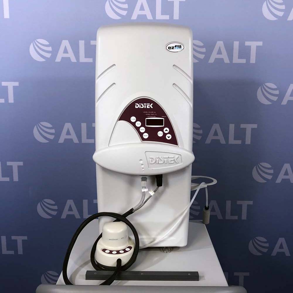
Phase One Design worked with Distek, Inc. to develop the original ezfill, a device that dispensed the testing medium used in pharmaceutical dissolution testing. For this updated version, we were tasked with integrating a touch screen interface into the original casework while preserving much of the existing pressure-forming tooling. Our team also helped with graphic layout and icon design for the new system interface.
Client
Distek
Skills
Branding
Graphic Design
Design For Printing and Die Cutting
Year
2020-2021
Updating an Existing Design
Distek wanted to get rid of the pushbuttons for the ezfill+ and replace them with a touch screen on the unit. They wanted to utilize the same housing (and tooling) as the ezfill and replace the old pad with a label that echoed their logo.
Differentiating between Distracting and Attractive
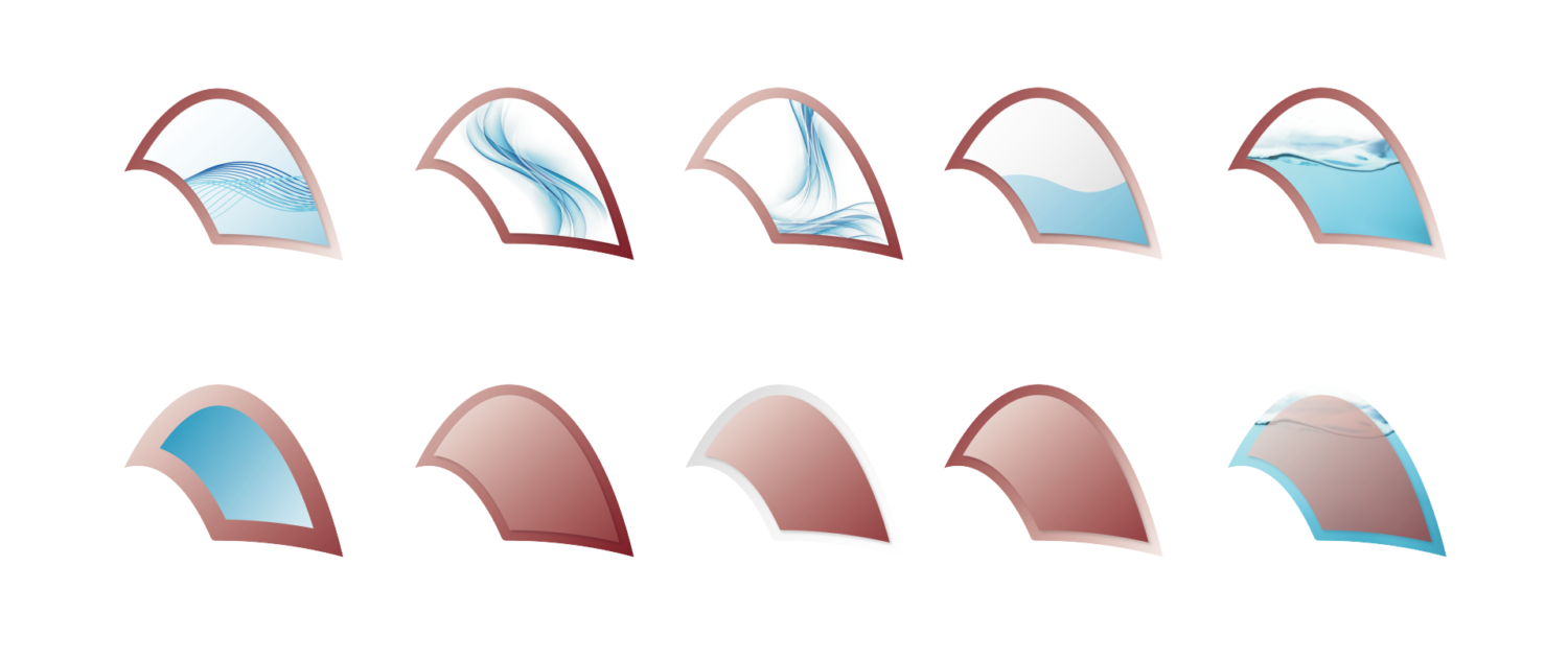
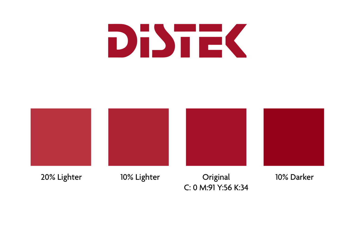
Distek wanted an overlay that tied into their logo and matched the existing branding color. Initially, we tried to tie in elements from the touch display but ultimately ruled this was too visually busy.
Focusing in on Red
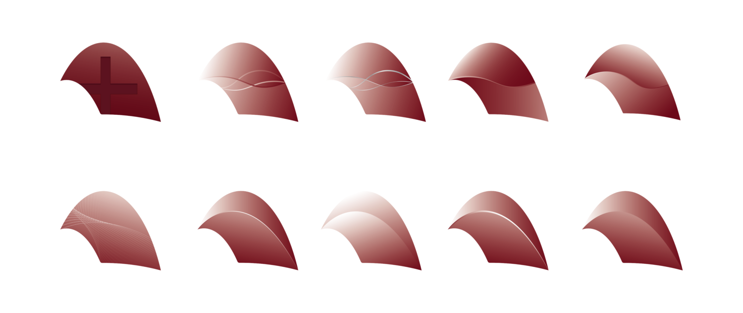
We experimented with how the use of gradients and strategically placed lines could add depth to the unit. In addition to a variety of designs that echoed the lines in the casework, we took a look at some more “eye-catching” approaches but quickly ruled these were too visually busy.
Matching the Color
After Distek picked a design, we worked closely with a printer to get prototypes made to ensure the colors properly matched the logo, which was previously designed in-house.
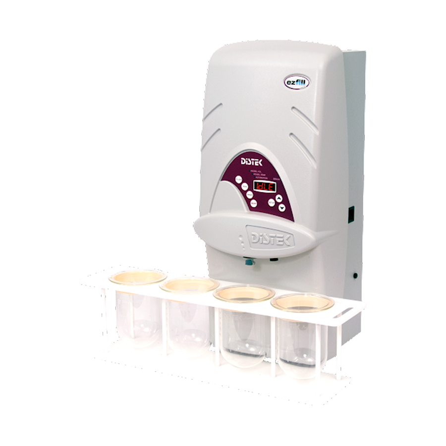
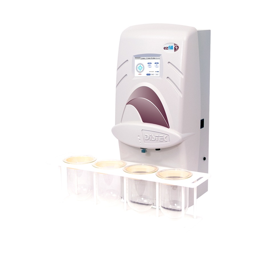
Slide to see the difference between the ezfill and ezfill+
Adding a Pop of Color
The new overlay fits perfectly where the old button pad and display sat. It highlights Distek’s colors, ties into the logo, and draws the user to the new touch interface. More information on the ezfill+ system can be found here.

